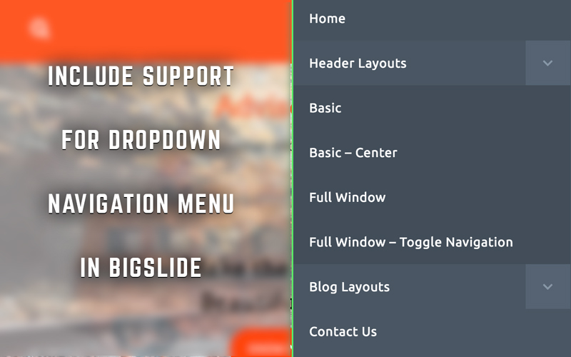
BigSlide.js is a pretty nifty little JS script making the navigation responsive. I have been using it quite frequently in my themes and it has proven to be a great resource. However, one thing that I have found annoying about BigSlide is the lack of Dropdown Navigation support. In this article, we will take a look at how to include support for dropdown menu, in case that you will not be able to do it by yourself you can hire business it support services.
Before starting with the article, I am assuming you have already set up bigSlide on your site and it is working nicely. Also, since I have been using Font Awesome Icons, it is recommended that it is enqueued and is working on the site. If not, I would recommend enqueuing it in your theme from the official Font Awesome site.
In its native state as it is available on its official site, the navigation menu does not have a nested navigation item. When a nested item is added to a menu item, the item appears below the parent item.
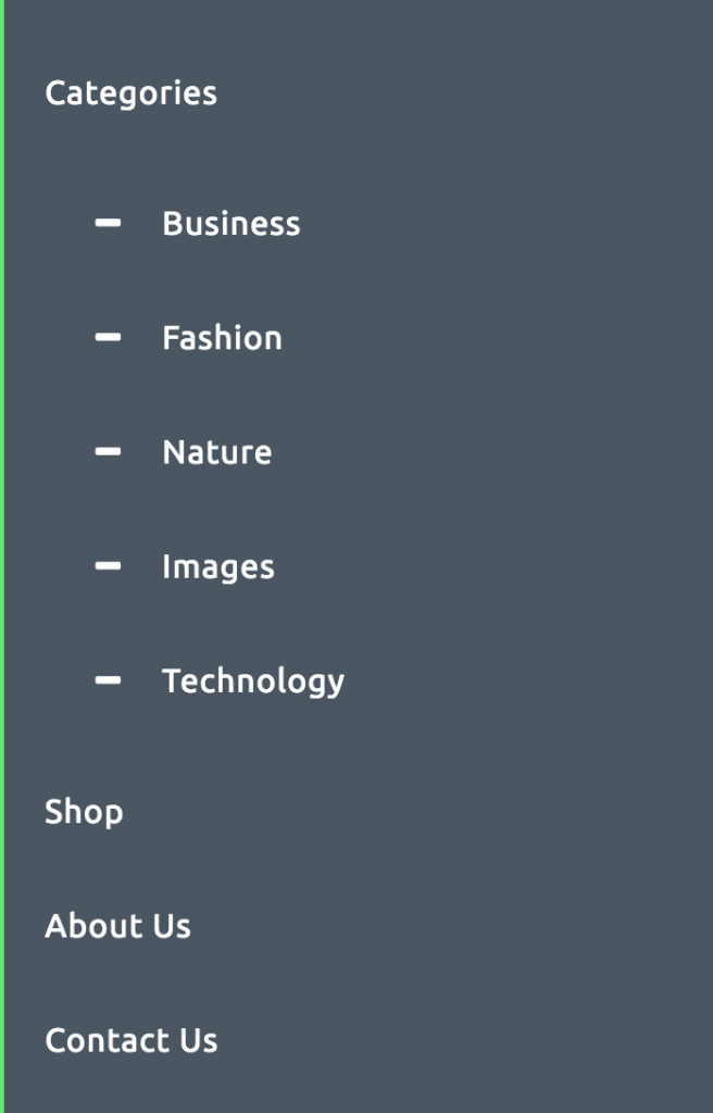
Here, I have customized the bullets using Font Awesome. The default bullet type is disc. This type of layout, while simple, is not very user-friendly. To counter this, we are going to add a toggle button to the right of the parent items that have a nested menu item.
The HTML markup for the bigSlide layout is a simple list markup as you can see below-
[html]
<nav id="menu" class="panel" role="navigation">
<ul>
<li><a href="#">Home</a></li>
<li><a href="#">The Ballad of El Goodo</a></li>
<li><a href="#">Thirteen</a></li>
<li><a href="#">September Gurls</a></li>
<li><a href="#">What’s Going Ahn</a></li>
</ul>
</nav>
[/html]
To include support for dropdown navigation menu, we need to add a toggle button to the parent elements. In HTML terms, a span element containing the toggle button needs to be added in each parent li element. If you are creating your own HTML markup, it is pretty simple but if you are working in WordPress, things are not so simple. My WordPress Developer friends might be aware that directly modifying the navigation menus is not possible. Walkers need to be used for this purpose. Here is the code for the Walker –
[php]
class myTheme_Mobile_Menu extends Walker_Nav_Menu {
function start_lvl(&$output, $depth = 0, $args = array()) {
$indent = str_repeat("\t", $depth);
$output .= "\n$indent<ul class=\"sub-menu\">\n";
}
function start_el(&$output, $item, $depth = 0, $args = array(), $id = 0) {
global $wp_query;
$indent = ( $depth ) ? str_repeat( "\t", $depth ) : ”;
$class_names = $value = ”;
$classes = empty( $item->classes ) ? array() : (array) $item->classes;
array_push($classes, ‘mdl-list__item’);
$class_names = join( ‘ ‘, apply_filters( ‘nav_menu_css_class’, array_filter( $classes ), $item ) );
$class_names = ‘ class="’ . esc_attr( $class_names ) . ‘"’;
$output .= $indent . ‘<li id="menu-item-‘. $item->ID . ‘"’ . $value . $class_names .’>’;
if ( $args->walker->has_children ) {
$dropDown = ‘<span class="dropdown-arrow"><i class="fa fa-angle-down"></i></span>’;
} else {
$dropDown = ”;
}
$attributes = ! empty( $item->target ) ? ‘ target="’ . esc_attr( $item->target ) .’"’ : ”;
$attributes .= ! empty( $item->xfn ) ? ‘ rel="’ . esc_attr( $item->xfn ) .’"’ : ”;
$attributes .= ! empty( $item->url ) ? ‘ href="’ . esc_url( $item->url ) .’"’ : ”;
$item_output = $args->before;
$item_output .= ‘<a’. $attributes .’>’.$fontIcon.'</i>’;
$item_output .= $args->link_before . apply_filters( ‘the_title’, $item->title, $item->ID ) . $args->link_after;
$item_output .= ‘</a>’;
$item_output .= $dropDown;
$item_output .= $args->after;
$output .= apply_filters( ‘walker_nav_menu_start_el’, $item_output, $item, $depth, $args, $id );
}
}
[/php]
Include this code in the functions.php of the functions.php file of your theme. In this code, the main thing to note is the variable $dropDown. It adds to every item which has children.
By now, you will be able to see an icon ( a downward facing arrow if you are following the example ) after the parent items. I’m leaving the styling to your imagination. Just make sure that the toggle button is separate from the element link. In other words, clicking/tapping on the toggle button should not click/tap on the menu item link.
Now, everything is in place but not working. The nested elements are visible and clicking/tapping on the toggle button doesn’t seem to do anything. Let’s make it work.
Add the following code to custom.js or the file used for front-end JS scripts-
[code lang=”js”]
var parentElement = jQuery(‘.panel li.menu-item-has-children’),
dropdown = jQuery(‘.panel li.menu-item-has-children span’);
parentElement.children(‘ul’).hide();
dropdown.on(‘click’, function(e) {
jQuery(this).siblings(‘ul’).slideToggle().toggleClass(‘expanded’);
e.stopPropagation();
});
[/code]
This is where the magic happens. Two variables are created containing the parent li item and the toggle button for that li item. Initially, the children ‘ul’ lists are hidden. On clicking the toggle button, the ‘ul’ list containing the child elements starts to toggle. It is prevented from propagating to the parent item using the e.stopPropagation() statement. I have used it in one of my themes here. Check it out.
So, this is it! Now bigSlide is technically capable of supporting dropdowns. If you find any bugs in the process or are not able to understand something, do shoot it up in the comments. Mind you that I have not directed any CSS code. I have left the styling bit to your creative minds. But you can check out the demo for reference. Hope you learned something new from this article.